4.3. Extension: The Problem With Distance Similarity#
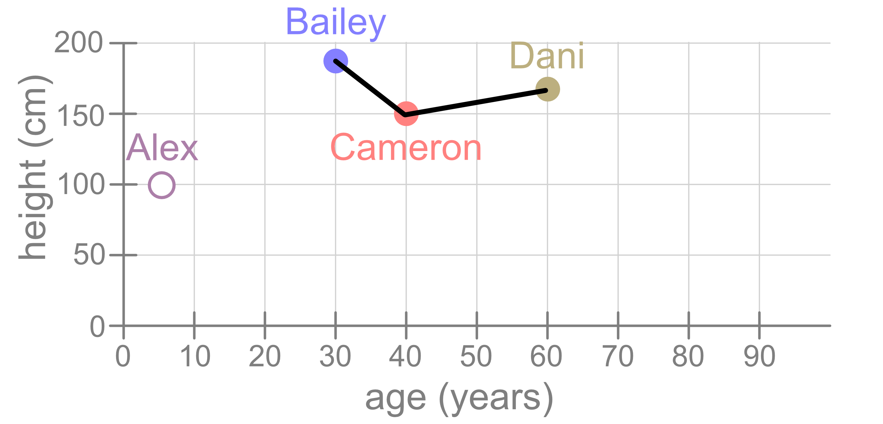
As we just saw, we can use distance between points as a way to measure the similarity of the samples. Using the same dataset as before, let’s ow consider Bailey. Judging from this figure, Bailey is more similar to Cameron than they are to Dani, and that’s because the distance between Bailey and Cameron is smaller than this distance between Bailey and Dani.
But what if we had drawn our figure differently? Consider the following visualisation. It shows the same data but with different stretches on the x and y axes.
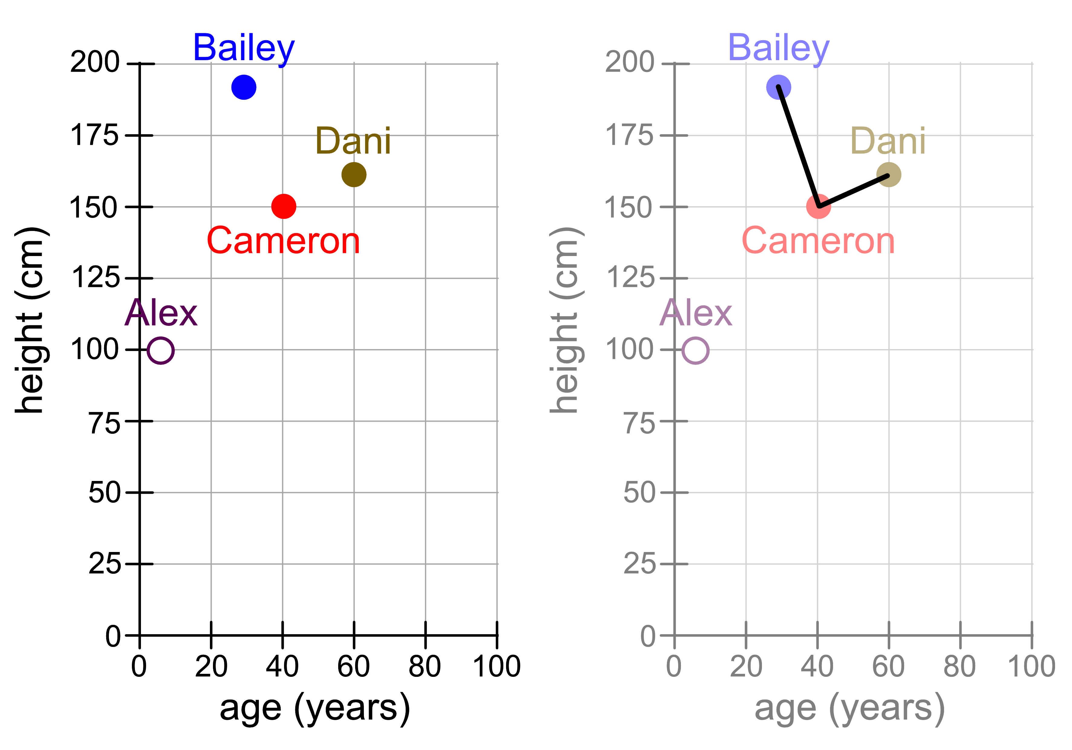
Suddenly the distance between Cameron and Dani looks smaller! Does that mean that Cameron is now more similar to Dani?
4.3.1. Standardisation#
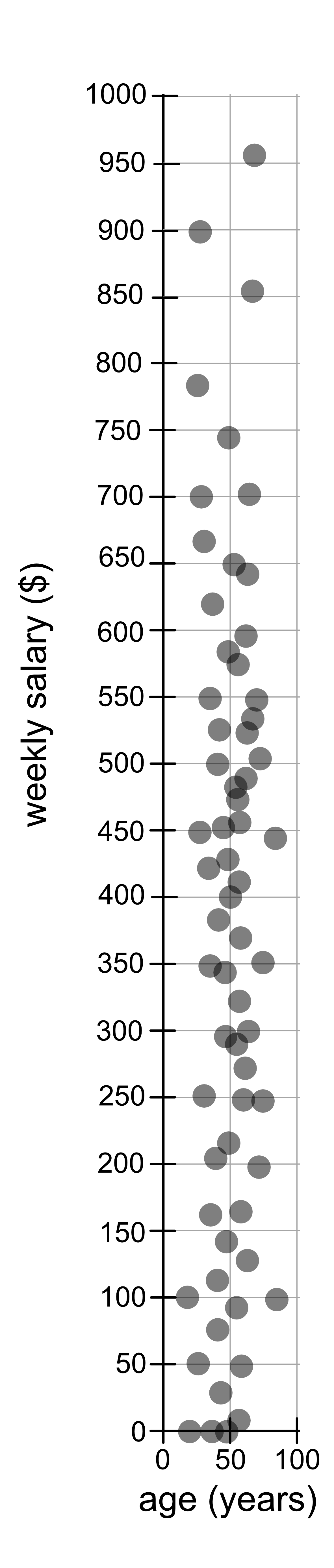
In the example we just saw, there is a problem with using pure distance to measure similarity. Age and years are quite similar in scale, in that age typically ranges from 0 - 100 years and height typically ranges from 0 - 200 cm. Other variables might be on a completely different scale. For example, age (0 - 100 years) and weekly salary ($0 - $1000). You will notice that each grid square represents 50 x 50 (years x $). Because the range of weekly salary values is so much larger than the scale of years, you’ll notice that the distance is dominated by the weekly salary variable and people tend to be close together if they have similar salaries, regardless of their age.
To manage this problem we standardise the data, which is essentially rescaling
the values. We can do this using sklearn’s StandardScalar. To use it we
first need to import it.
from sklearn.preprocessing import StandardScaler
Then we create a model:
scaler = StandardScaler()
We fit it to the data:
scaler.fit(data)
And then we use it to transform, i.e. rescale our original data.
rescaled_data = scaler.transform(data)
Here is an example where we use it to transform our age and weekly salary data.
age_salary.csv
from sklearn.preprocessing import StandardScaler
import matplotlib.pyplot as plt
import pandas as pd

data = pd.read_csv("age_salary.csv").to_numpy()

# Original Data
plt.figure(figsize=(1.5, 4))
plt.scatter(data[:, 0], data[:, 1], alpha=0.7)
plt.xlabel("age (years)")
plt.ylabel("weekly salary ($)")
plt.axis("equal")
plt.tight_layout()
plt.savefig("original.png")

# Rescaled Data
scaler = StandardScaler()
scaler.fit(data)
rescaled_data = scaler.transform(data)

plt.figure(figsize=(3, 3))
plt.scatter(rescaled_data[:, 0], rescaled_data[:, 1], alpha=0.7)
plt.xlabel("age")
plt.ylabel("weekly salary")
plt.axis("equal")
plt.tight_layout()
plt.savefig("rescaled.png")
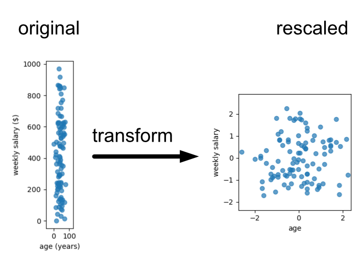
For the purposes of this lesson we’ll provide data that is roughly on the same scale, drawn on similar scales or already standardised. Thus, we’ll ignore the standardisation step, but you will need to know that this is an important step when applying machine learning methods that rely on distance. Examples of this include K-nearest neighbours regression/classification or K-means clustering.