4.9. Extension: Selecting The Value of k#
Changing the value of k changes the number of neighbours used to average over when making a prediction. Here is a visualisation of what changing the value of k looks like on our water intake dataset.
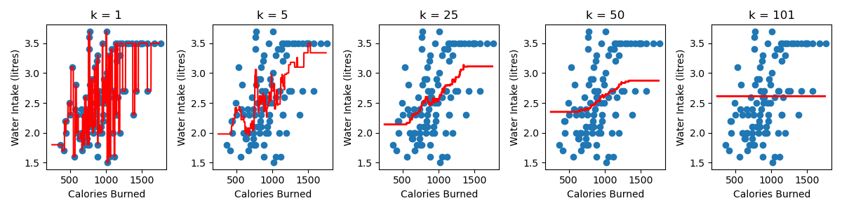
A few observations:
The smaller the value of k, the more complex the model is. The complexity refers to the shape of the red line. You’ll notice that for a large k, in this example k = 101, we have a simple model, which takes the form of a flat line. We get a flat line because there are only 101 samples in the dataset, so every training samples is always a neighbour and our prediction is just the average water intake of all the training data.
As you increase the value of k, the predictions at the edges of the region are worse. This is what we call a bias and it happens because our training sample are not equally balanced around our point of interest.
4.9.1. Understanding The Bias#
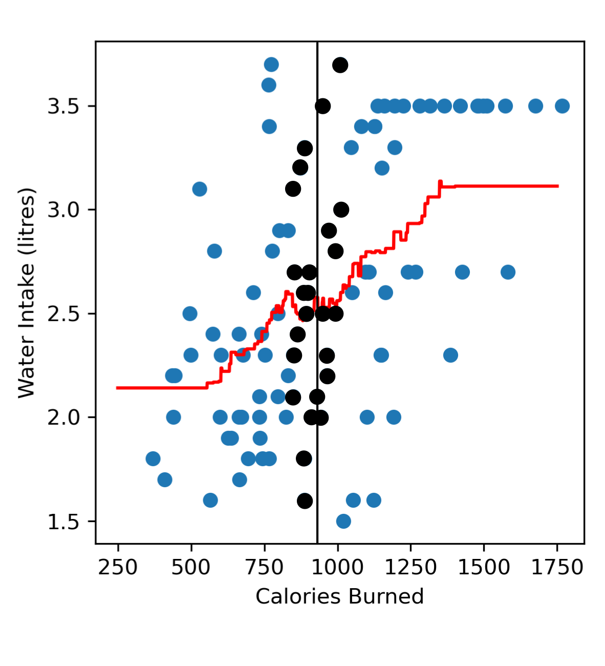
If we consider a point near the centre of our dataset, e.g. someone who has burned 900 calories. We’ll see that in our dataset we can find many similar neighbours, i.e. other gym goers who have also burned ~900 calories with a roughly equal number of people who have burned less than 900 calories and more than 900 calories.
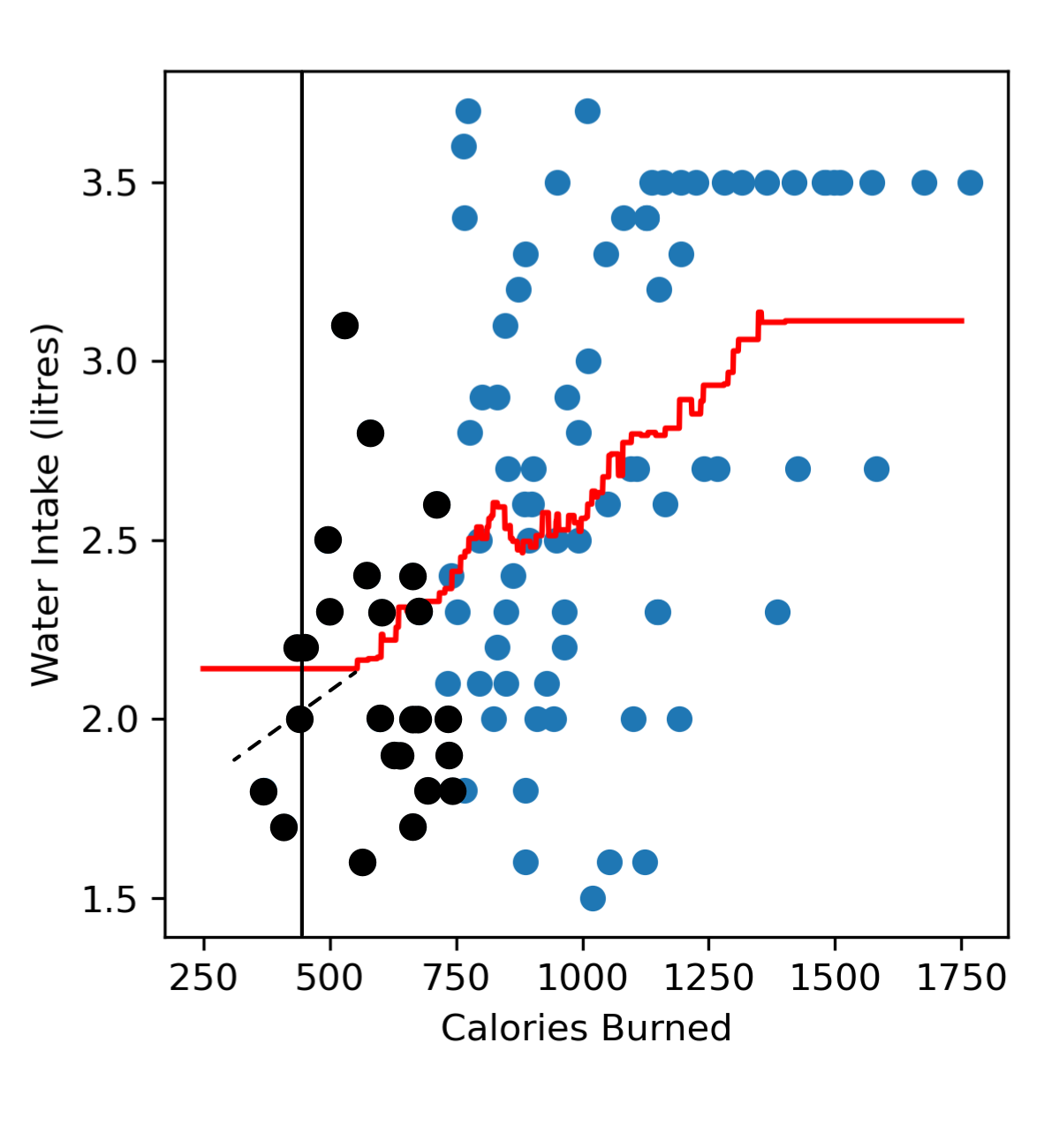
Now if we look towards the left end region of our dataset trying to predict the amount of water someone drinks after burning 400 calories, we’ll see that we don’t have a lot of samples representing gym goers who have burned less than 400 calories. When we look at all our neighbours there are more neighbours burning more than 400 calories, and are also drinking more water. This means that in the left end region of our model we tend to predict a higher water intake (red line) than we probably should (black dashed line).
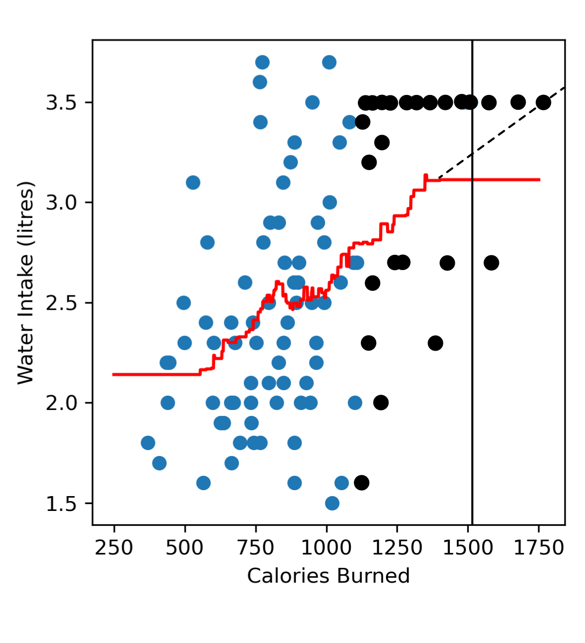
Similarly, in the far right region when we try to predict the amount of water someone drinks after burning 1500 calories, we tend to have more neighbours burning less than 1500 calories, and are drinking less water. So in the far right region of our model we tend to predict a lower water intake (red line) than we probably should (black dashed line).
4.9.2. Selecting k#
When selecting the best value of k we want to find a balance where our model isn’t too complicated but also doesn’t have a high bias. The best way to select a value of k is to use a validation set to determine which value of k results in the best performance on new data. This is the same process that you would use to select the polynomial degree in polynomial regression.
We break our data up into:
training data: Used to fit the model (it’s what you provide when you call
.fit()). This is what the model ‘sees’ as it’s trying to figure out the the shape of the curve it should produce.validation data: Used to determine the best value of k that should be used to fit the data.
test data: Used to estimate the performance of the final model.
Essentially we would try different values of k and then calculate the mean squared error on the validation data and fill in the table below. We start at k=1 and go up to k=n, where n is the number of training samples.
k |
Age (years) |
Height (cm) |
|---|---|---|
1 |
||
2 |
||
… |
||
n |
The value of k that we should pick is the one that results in the lowest MSE on the validation data!
Code challenge: Extension: Select The Best Value of k
We will use the validation data to determine the best value of k for or knn regression model to predict water intake from calories burned.
Instructions
Copy and paste in your code from the ‘Build a KNN Regression Model (k=1)’ challenge
You will need to adapt this code so that you read the
'Calories'and'Water'columns ofwater_intake_train.csvintox_trainandy_trainand the columns ofwater_intake_vali.csvintox_valiandy_valiConvert these to numpy arrays
Construct a for loop to test values of k from 1 to 101 (inclusive)
For each k, create a KNeighborsRegressor model to fit the training data and then calculate the mean squared error on the validation data
Choose the k that corresponds to lowest mean squared error on the validation data
Rebuild your KNeighborsRegressor model using the chosen k
Create x and y values to visualise the model.
Use
np.linspace(250, 1750, 1750)to create an array of x valuesUse
.predict()to create a corresponding set of y values
Produce a figure that:
Has
figsize=(4, 4)Plots the training data as a scatter plot
Plots the validation data as a scatter plot (just add another
plt.scatter)Plots the KNN regression as a line, in red
Has labels Calories Burned and Water Intake (litres)
Your plot should look like this:

Solution
Solution is locked
Code challenge: Extension: Evaluate Your KNN Model
Now that we’ve chosen the best value of k, let’s evaluate the performance of this model on test data!
Generally the more data we have to train our model, the better our model is. Now that we’ve used our validation data to determine our best value of k, we no longer need it. But there’s no point throwing out good data, we can add it to our training data! Remember that when we evaluate our model on the test data, the model is not allowed to have seen the test data before. But since our training and validation data is different from the test data, we aren’t breaking any rules by combining our training and validation data to make a larger training set.
Instructions
Copy and paste in your code from the ‘Build a KNN Regression Model (k=1)’ challenge
You will need to adapt this code so that you read the
'Calories'and'Water'columns ofwater_intake_train.csvintox_trainandy_train, the columns ofwater_intake_vali.csvintox_valiandy_valiand the columns ofwater_intake_test.csvintox_testandy_testConvert these to numpy arrays
Use
np.concatenate()to combine the training and validation data (see hint below)Using
sklearn, create aKneighborsRegressormodel to fit to the combined training and validation dataSet the value of k to the same value that of k you chose for the ‘Extension: Select The best Value of k’ exercise
Predict the water intake of the samples in the test data
Calculate and print the mean squared error of the model on the test data
Your output should look like this:
X.XXXXXXXXXXXXXXXXX
You do not need to produce a figure of your KNN model, but if you did it should look like this:

You will notice that the model looks slightly different from the figure in the previous exercise and that’s because it’s being trained on both the training and the validation data whereas in the previous exercise the model was built using only the training data. Since the model is given more data we should, in theory, get a more accurate model, so the fit should look better and be a closer representation of the true relationship between calories burned and water intake.
Note
You can use np.concatenate((x, y)) to join numpy arrays. Here is an example:
import numpy as np
x = np.array([1, 2, 3])
y = np.array([4, 5, 6])
z = np.concatenate((x, y)) # Note that we use two sets of brackets
print(z)
Solution
Solution is locked