4.6. Extension: Visualising KNN Regression 1D (k = 2)#
We can apply the same logic for different values of k, but it does get a bit trickier.
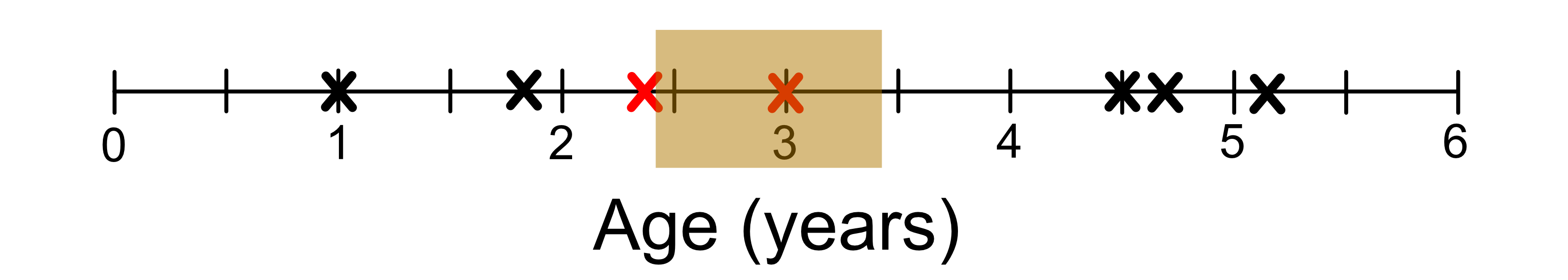
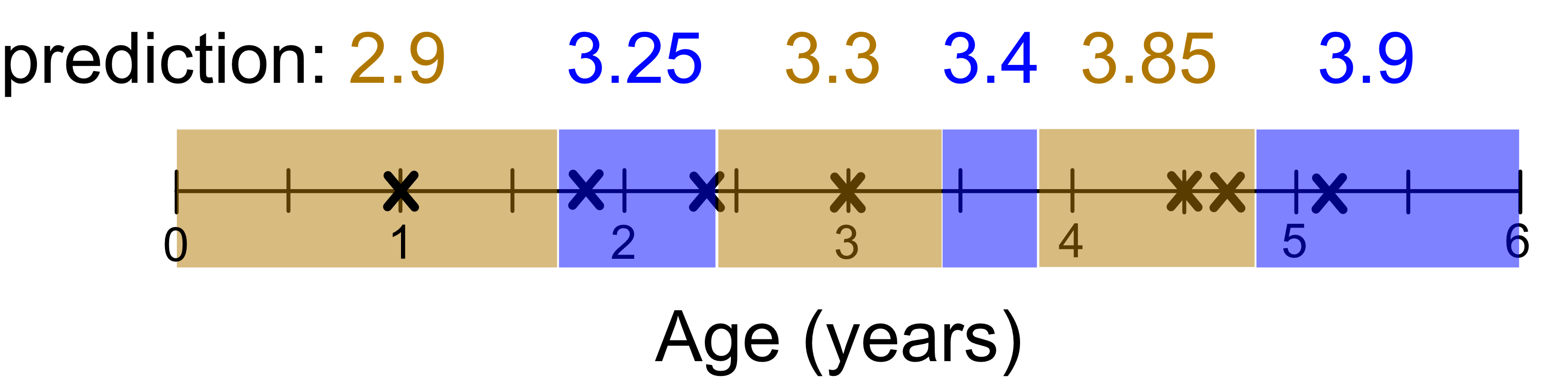
Let’s look at the case where k = 2. First we identify the neighbourhoods. If you look at the diagram below, this is the neighbourhood identified by the two red crosses.
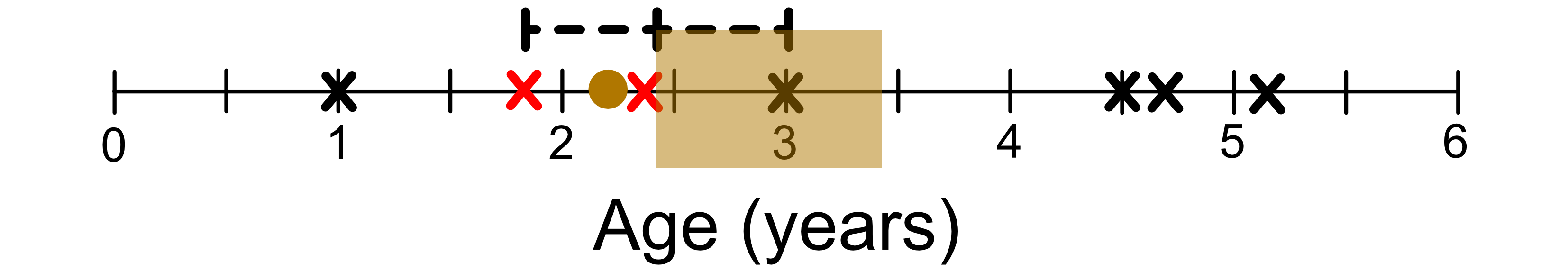
Moving to the left of this neighbourhood will change the two closest neighbours as shown below.
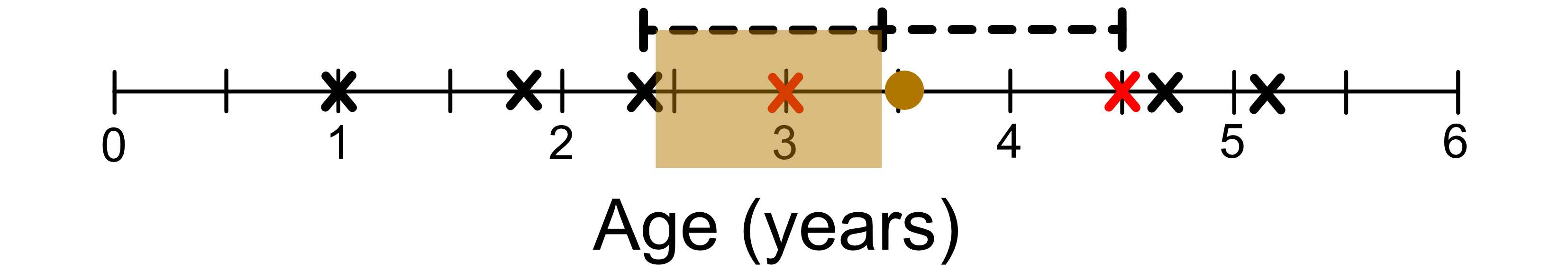
Similarly, moving to the right of this neighbourhood will change the two closest neighbours as shown below.
You’ll have noticed that the edge of the neighbourhood correspond to midpoints between pairs of samples that are at least one apart.
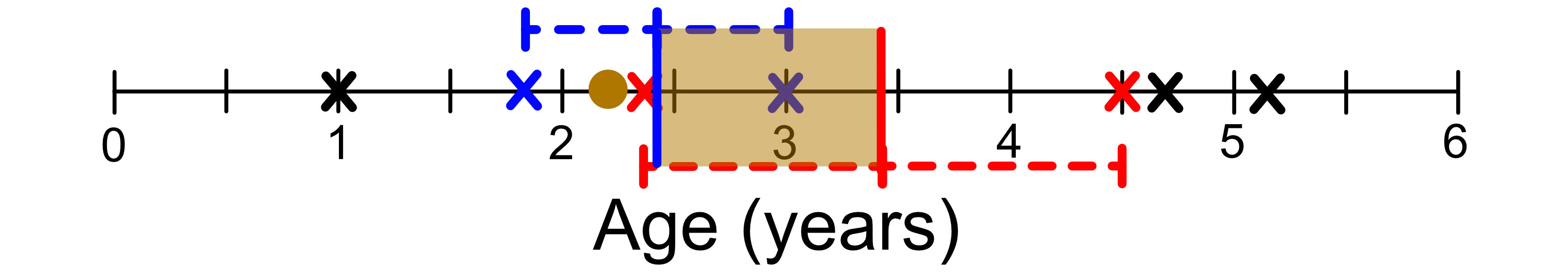
Again we can draw the neighbourhoods. Note that the predicted values are the average of the 2 nearest neighbours.
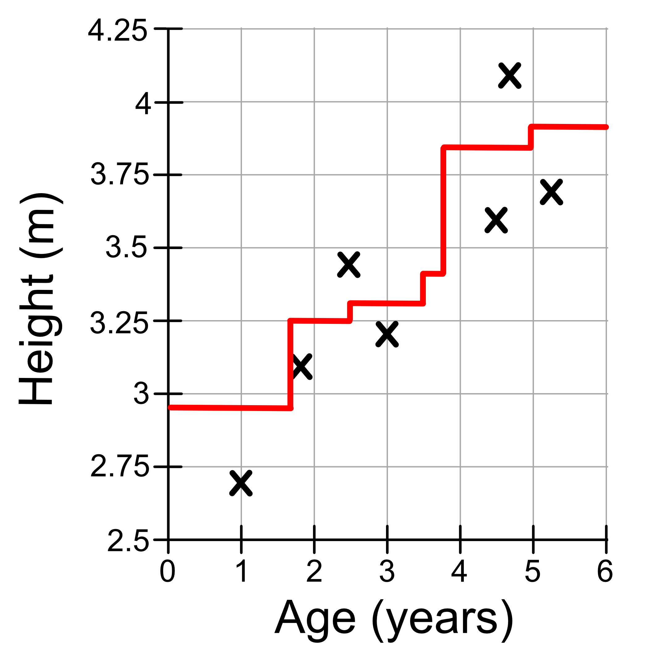
Visualising the final result we get:
The same logic will apply for k = 3, and so on…
What you need to do is determine the neighbourhoods in which the neighbours don’t change, calculate the average of the neighbours, and that’s your prediction. As a result KNN models look like ‘steps’ where
The location of the steps correspond to when the neighbourhood changes.
The height corresponds to the average value of the neighbours.