2.4. Building a Polynomial Regression Model#
To construct the 2D array required as input to our polynomial regression model
we can use PolynomialFeatures
from sklearn.preprocessing. We import it with the following:
from sklearn.preprocessing import PolynomialFeatures
Then we create a PolynomialFeatures object:
poly = PolynomialFeatures(degree, include_bias=False)
We set include_bias to False. bias is another word for intercept
and our linear regression model will automatically calculate the intercept for
us.
Finally, we pass in the input variable we’re interested in.
X = poly.fit_transform(x)
Note
x must be a 2D array with n rows, one for each sample in the dataset
and 1 column. An easy way to achieve this is to use .reshape(-1, 1)
Here’s a quick example of how it works on an array containing the values [1,
2, 3, 4, 5]. You’ll notice that the first column is \(x\), the second
column is \(x^2\) and the third column is \(x^3\).
from sklearn.preprocessing import PolynomialFeatures
import numpy as np

x = np.array([1, 2, 3, 4, 5])

poly = PolynomialFeatures(3, include_bias=False)
X = poly.fit_transform(x.reshape(-1, 1))

print(X)
Output
[[  1.   1.   1.]
[  2.   4.   8.]
[  3.   9.  27.]
[  4.  16.  64.]
[  5.  25. 125.]]
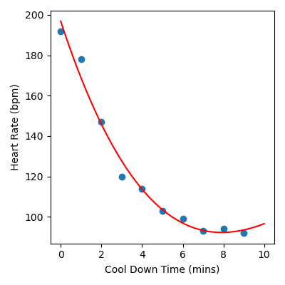
The following is a complete example of how we would fit a polynomial model of
degree 3 to our heart rate during cool down time data, which is stored in
cool_down.csv. You will notice
that the code is very similar to the code we used to build our linear
regression model.
from sklearn.linear_model import LinearRegression
from sklearn.preprocessing import PolynomialFeatures
import matplotlib.pyplot as plt
import pandas as pd
import numpy as np

# Load data
data = pd.read_csv("cool_down.csv")
x = data["Cool Down Time (mins)"].to_numpy()
y = data["Heart Rate (bpm)"].to_numpy()

# Build polynomial regression model
poly = PolynomialFeatures(3, include_bias=False)
X = poly.fit_transform(x.reshape(-1, 1))
linear_reg = LinearRegression()
linear_reg.fit(X, y)

# Create x and y values to visualise the model function
x_model = np.linspace(0, 10).reshape(-1, 1)
X_model = poly.fit_transform(x_model)
y_model = linear_reg.predict(X_model)

# Visualise the results
plt.figure(figsize=(4, 4))
plt.scatter(x, y)
plt.plot(x_model, y_model, color="red")
plt.xlabel("Cool Down Time (mins)")
plt.ylabel("Heart Rate (bpm)")
plt.tight_layout()
plt.savefig("plot.png")
Output
Code Challenge: Visualise the Data
You have been provided with a csv file called sydney_temps.csv
with data obtained from Kaggle . This data contains the following columns:
Days
MaxTemp
We will use this data to build a polynomial regression model that can help predict the maximum temperature (in degrees Celsius) for a given day of the year in Sydney.
Instructions
Using pandas, read the file
sydney_temps.csvinto aDataFrameExtract the
'Day'column into the variablexExtract the
'MaxTemp'column into the variableyConvert both
xandyto numpy arraysProduce a figure that visualises the data. The figure should:
have figsize (5, 4)
plots the data as a scatter plot,
alpha = 0.5Have labels Day of the Year and Maximum Temperature
Your plot should look like this:

Solution
Solution is locked
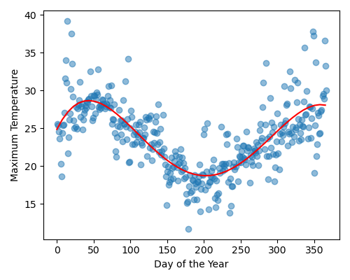
Code Challenge: Polynomial Degree 4
Now we’ll build a polynomial regression model of degree 4.
Instructions
Copy and paste your code from the ‘Visualise the Data’ challenge
Using
sklearn, create aPolynomialFeaturesobject and use it to construct a 2D array with columns corresponding to \(x\), \(x^2\), \(x^3\) and \(x^4\).Using
sklearn, create aLinearRegressionmodel and fit it to the Sydney temperature dataCalculate the x and y values to plot the function associated with the polynomial regression model
Use
np.linspace(0, 365)to create the x valuesUse
.predict()to create a corresponding set of y values
Produce a figure that:
Plots the data as a scatter plot as in the ‘Visualise the Data’ challenge
Plots the polynomial regression model as a line, in red
Your plot should look like this:
Solution
Solution is locked