1.6. Scatter Plots#
It will be useful for us to be able to visualise our data. To do this we will
be using Python’s matplotlib.pyplot library. The pyplot library is
incredibly powerful. It has functions for every standard plot type. You can see
examples of all the different types of plots in the matplotlib gallery.
First we’ll need to import the library
import matplotlib.pyplot as plt
Next, we will create a figure, and specify the figure size.
plt.figure(figsize=(width, height))
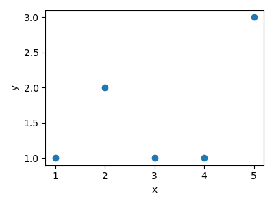
To generate a scatter plot we use:
plt.scatter(x_values, y_values)
To add axis labels to our figure we use:
plt.xlabel(x_axis_label)
plt.ylabel(y_axis_label)
Similarly, to create the plot title, we use:
plt.title(title)
Then to automatically crop the image we use:
plt.tight_layout()
And then to view the plot we use:
plt.savefig(filename)
import matplotlib.pyplot as plt
import numpy as np

x = np.array([1, 2, 3, 4, 5])
y = np.array([1, 2, 1, 1, 3])

plt.figure(figsize=(4, 3))
plt.scatter(x, y)
plt.xlabel("x")
plt.ylabel("y")
plt.tight_layout()
plt.savefig("plot.png")
We are also able to update the size, colour and transparency of the markers in our plot using the following:
plt.scatter(
    x_values, y_values, marker=marker_style, s=size, c=colour, alpha=transparency
)
Note
alpha takes on values between 0 and 1 where 1 means the marker is
opaque and 0 means the marker is transparent.
We can also set the limits of the x-axis and y-axis
plt.xlim([x_min, x_max])
plt.xlim([y_min, y_max])
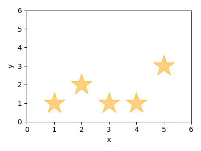
Here is an example, where we plot our data using large orange transparent stars and we set both axes to span between 0 and 6.
import matplotlib.pyplot as plt
import numpy as np

x = np.array([1, 2, 3, 4, 5])
y = np.array([1, 2, 1, 1, 3])

plt.figure(figsize=(4, 3))
plt.scatter(x, y, marker="*", s=1000, c="orange", alpha=0.5)
plt.xlabel("x")
plt.ylabel("y")
plt.xlim([0, 6])
plt.ylim([0, 6])
plt.tight_layout()
plt.savefig("plot.png")