1.7. Visualising Data#
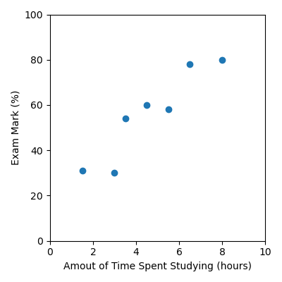
We can visualise datasets using a scatter plots. For example, we can visualise the study data we were working with earlier:
Time Spent Studying (hours) |
Exam Mark (%) |
|---|---|
4.5 |
60 |
8 |
80 |
1.5 |
31 |
3.5 |
54 |
5.5 |
58 |
3 |
30 |
6.5 |
78 |
First we need to read the data in from a csv file using pandas, and then we’ll
visualise the data using a scatter plot. study.csv
import pandas as pd
import matplotlib.pyplot as plt

data = pd.read_csv("study.csv")

x = data["Time Spent Studying (hours)"].to_numpy()
y = data["Exam Mark (%)"].to_numpy()

plt.figure(figsize=(4, 4))
plt.scatter(x, y)
plt.xlabel("Amout of Time Spent Studying (hours)")
plt.ylabel("Exam Mark (%)")
plt.xlim([0, 10])
plt.ylim([0, 100])
plt.tight_layout()
plt.savefig("plot.png")
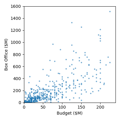
Code Challenge: Visualise Movie Data
We will be using the same movie.csv dataset we were working with earlier.
Instructions
Copy and paste in your code from the previous challenge that read
'Budget ($M)'and'Box Office ($M)'into numpy arraysCreate a scatter plot of the data with the following:
set the figure size to: (4, 4)
marker size: 5
alpha: 0.5
x axis label: Budget ($M)
y axis label: Box Office ($M)
x limits: 0 to 240
y limits: 0 to 1600
Your plot should look like this:
Solution
Solution is locked