2.8. Building a Logistic Regression Model#
Building a logistic regression model using pandas and sklearn is very similar
building a linear regression model. Let’s first look at our dataset.
pass_fail.csv
import pandas as pd

data = pd.read_csv("pass_fail.csv")
print(data)
Output
Time Spent Studying (hours)  Exam Result
0                          4.5            1
1                          8.0            1
2                          1.5            0
3                          3.5            1
4                          5.5            1
5                          3.0            0
6                          6.5            1
Now we can build our logistic regression model. Instead of importing
LinearRegression, we import LogisticRegression.
from sklearn.linear_model import LogisticRegression
import pandas as pd

data = pd.read_csv("pass_fail.csv")
x = data["Time Spent Studying (hours)"].to_numpy()
y = data["Exam Result"].to_numpy()

logistic_reg = LogisticRegression()
logistic_reg.fit(x.reshape(-1, 1), y)

beta0 = logistic_reg.intercept_
beta1 = logistic_reg.coef_[0]
print(beta0)
print(beta1)
Output
[-3.10848094]
[1.02761712]
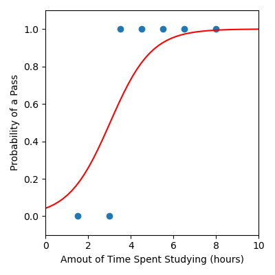
We can also visualise our model.
from sklearn.linear_model import LogisticRegression
import matplotlib.pyplot as plt
import pandas as pd
import numpy as np

# Load data
data = pd.read_csv("pass_fail.csv")
x = data["Time Spent Studying (hours)"].to_numpy()
y = data["Exam Result"].to_numpy()

# Build logistic regression model
logistic_reg = LogisticRegression()
logistic_reg.fit(x.reshape(-1, 1), y)

beta0 = logistic_reg.intercept_
beta1 = logistic_reg.coef_[0]

# Create x and y values to visualise the model function
x_model = np.linspace(0, 10, 50)
y_model = 1 / (1 + np.exp(-(beta0 + beta1 * x_model)))

plt.figure(figsize=(4, 4))
plt.scatter(x, y)  # Data
plt.plot(x_model, y_model, color="red")  # Model
plt.xlabel("Amout of Time Spent Studying (hours)")
plt.ylabel("Probability of a Pass")
plt.xlim([0, 10])
plt.ylim([-0.1, 1.1])
plt.tight_layout()
plt.savefig("plot.png")
Output
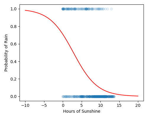
Code Challenge: Build a Logistic Regression Model
You have been provided with a csv file called rain.csv
with data obtained from Kaggle . This data contains the following columns:
Sunshine
Humidity
RainTomorrow
We will use the Sunshine column (the number of sunshine hours in a given day) to develop a logistic regression model that can help predict whether it’s going to rain tomorrow.
Instructions
Using pandas, read the file
rain.csvinto aDataFrameExtract the
'Sunshine'column into the variablexExtract the
'RainTomorrow'column into the variableyConvert both
xandyto numpy arraysUsing
sklearn, create aLogisticRegressionmodel to fit the training dataCreate x and y values to visualise the model.
Use np.linspace(-10, 20, 100) to create an array of x values
Use the formula \(\cfrac{1}{1+e^{-(\beta_0 + \beta_1 x)}}\) to create a corresponding set of y values
Produce a figure that:
Has figsize (5, 4)
Plots the data as a scatter plot, alpha = 0.1
Plots the linear regression as a line, in red
Has labels Hours of Sunshine and Probability of Rain
Your plot should look like this:
Solution
Solution is locked