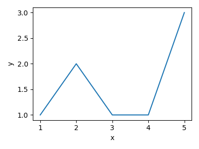
1.9. Line Plots#
Line plots are one of the most commonly used plots. We can use line plots to
visualise our machine learning models. Creating a line plot is very similar to
scatter plots but instead of plt.scatter, we use plt.plot.
plt.plot(x_values, y_values)
import matplotlib.pyplot as plt
import numpy as np

x = np.array([1, 2, 3, 4, 5])
y = np.array([1, 2, 1, 1, 3])

plt.figure(figsize=(4, 3))
plt.plot(x, y)
plt.xlabel("x")
plt.ylabel("y")
plt.tight_layout()
plt.savefig("plot.png")
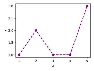
Just like with our scatter plot, we are able to format our line plots.
plt.plot(
    x_values,
    y_values,
    color=colour,
    linestyle=linestyle,
    marker=marker_style,
    linewidth=linedwith,
)
import matplotlib.pyplot as plt
import numpy as np

x = np.array([1, 2, 3, 4, 5])
y = np.array([1, 2, 1, 1, 3])

plt.figure(figsize=(4, 3))
plt.plot(x, y, color="purple", linestyle="--", marker="o", linewidth=2)
plt.xlabel("x")
plt.ylabel("y")
plt.tight_layout()
plt.savefig("plot.png")