4.5. Visualising KNN Regression 1D (k = 1)#
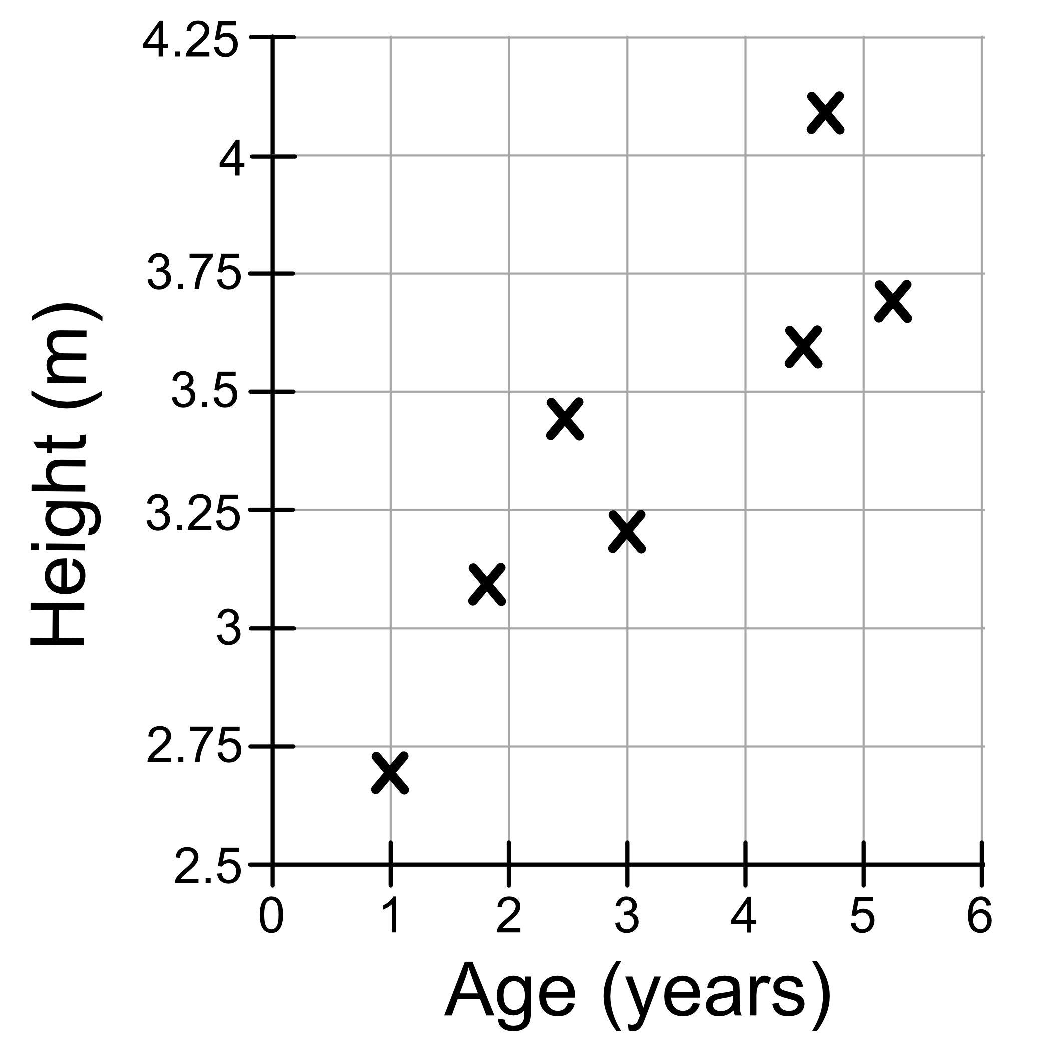
We’ll continue using our giraffe height dataset as shown below.
Age (years) |
Height (cm) |
|---|---|
1.0 |
2.7 |
1.7 |
3.1 |
3.0 |
3.2 |
2.4 |
3.4 |
4.7 |
4.1 |
5.2 |
3.7 |
4.5 |
3.6 |
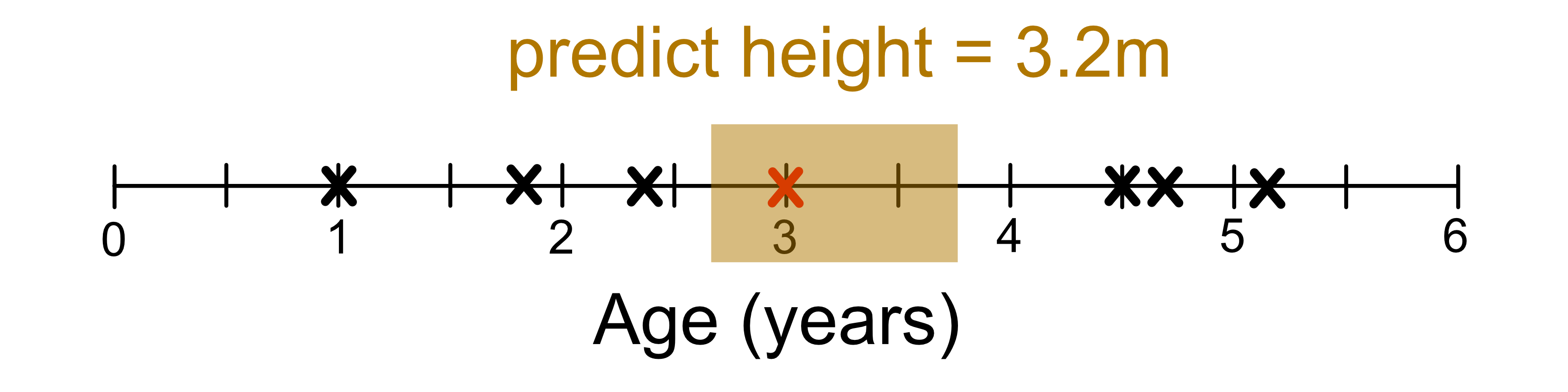
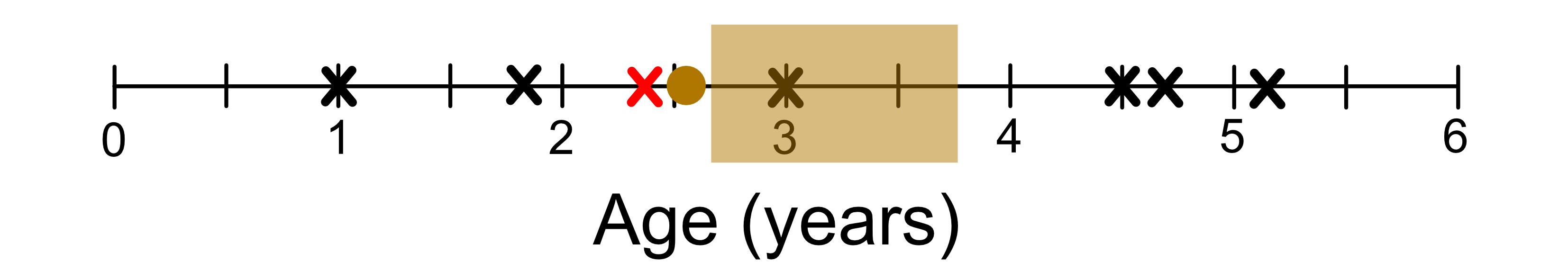
As discussed previously, the value of k we choose will result in a different model. Let’s first consider the case where k = 1. We saw previously that for age = 2.8, our model predicts the giraffe’s height to be 3.2, and that’s because the most similar giraffe in our dataset had a height of 3.2.
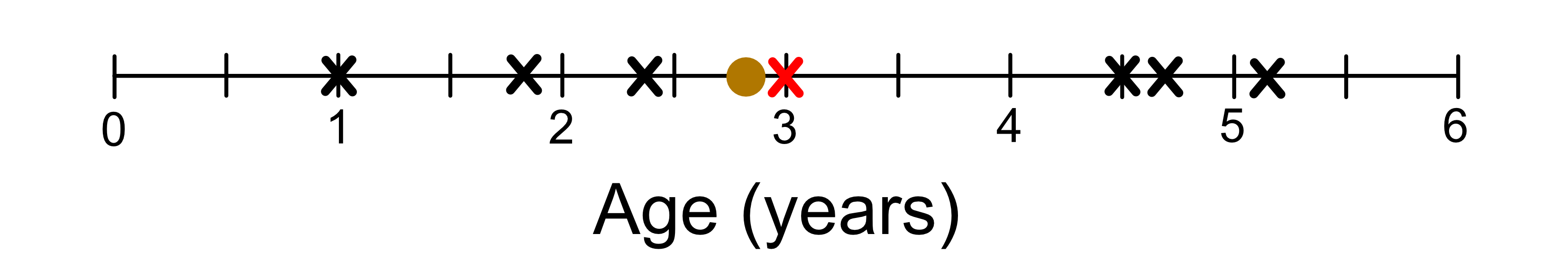
As long as the nearest neighbour is that same giraffe (aged 3), our model will alway predict a height of 3.2. This is indicated by the shaded region in the figure below. We can call this the ‘neighbourhood’.
Once we move out of the neighbourhood (shaded region), our closest neighbour changes.
We can visualise the ‘neighbour hood’ of each training sample as shown below.
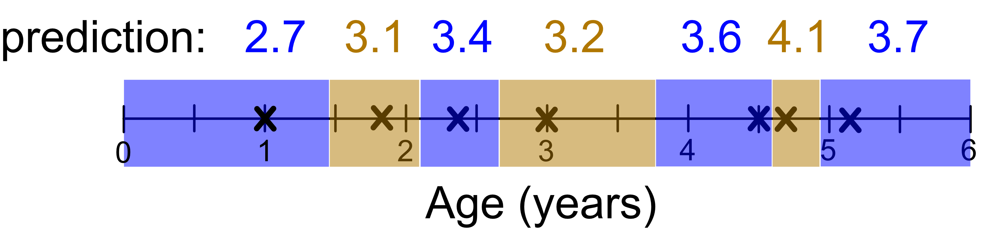
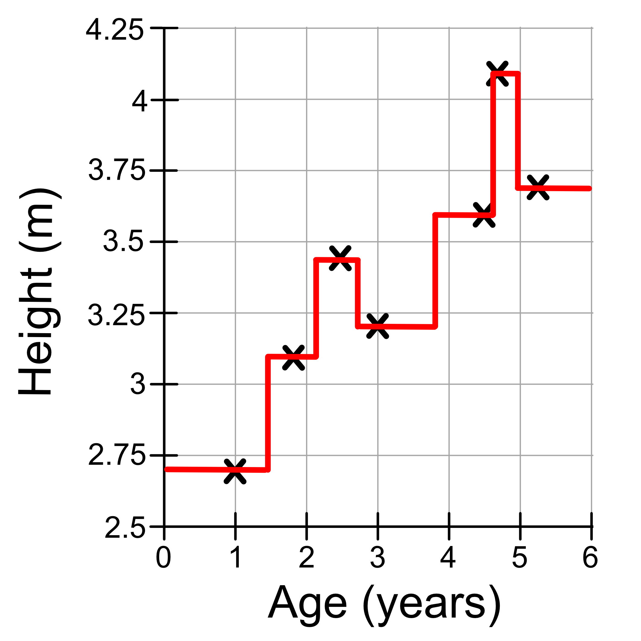
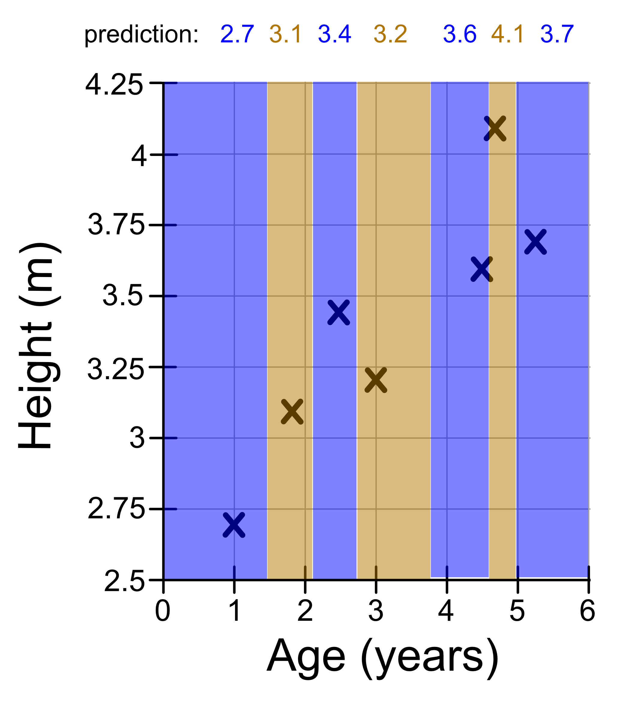
We can draw these neighbourhoods on our graph.
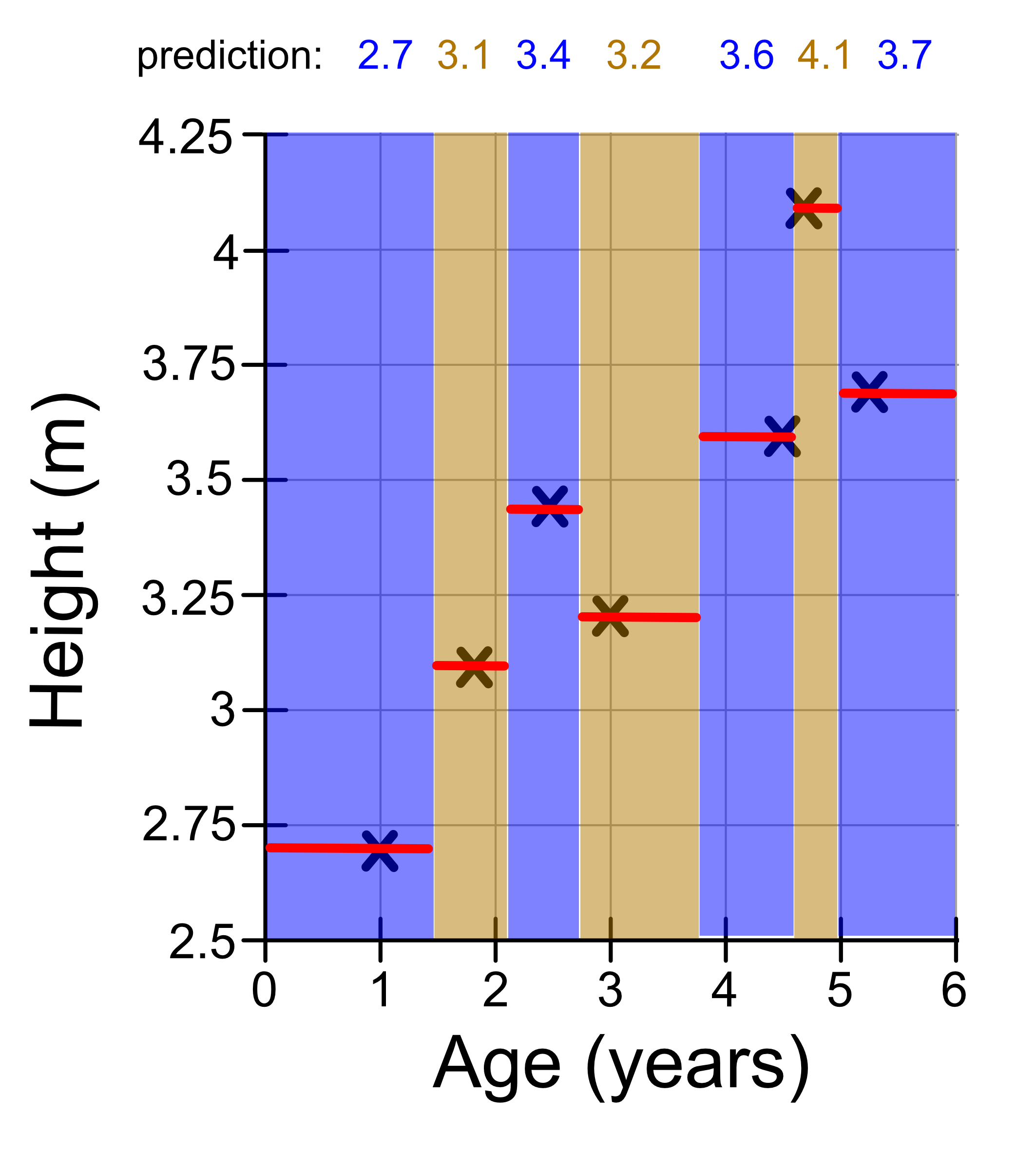
Let’s draw these predictions on in a red line.
To visualise this more clearly we can remove the shaded neighbourhoods. We will also add vertical lines to connect the ‘steps’. This is what our final model looks like!